|
|
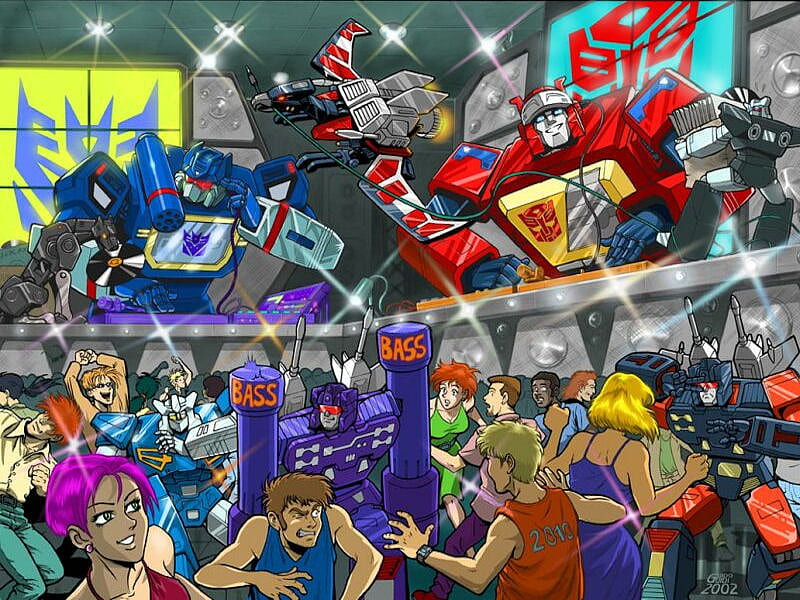
Post by Hoist on Feb 14, 2016 18:10:38 GMT -5
When I made the current background it was for optimization reasons as I was having loading issues with the last one, but the current one is kind of basic, and perhaps a little amateurish. I found a new one but I'm not sure which is preferable. I made the red first to keep with the current theme but as it's a bit Cybertron-esq I thought a blue one might be preferable - help me decide! Thumbs:   |
|
|
|
Post by ShadowShock on Feb 15, 2016 16:20:02 GMT -5
Ah, so hard! I almost voted for the Blue version because I'm biased that way.  But while the blue is nice and might match with Cybertron's surface color, the tone seems to pull the color out from the rest of the page and make it a little more bland. Red it is, it makes a good contrasting background color without being overwhelming. |
|
|
|
Post by Jazzman Crothers on Feb 15, 2016 16:27:07 GMT -5
Red. It has more energy. I vote red.
|
|
|
|
Post by Bomblast on Feb 15, 2016 16:58:56 GMT -5
I say Red. Seems to draw my eye more.
|
|
|
|
Post by Hoist on Feb 15, 2016 17:44:45 GMT -5
Interesting, interesting! Ah, so hard! I almost voted for the Blue version because I'm biased that way. But while the blue is nice and might match with Cybertron's surface color, the tone seems to pull the color out from the rest of the page and make it a little more bland. Red it is, it makes a good contrasting background color without being overwhelming. Funnily enough, I had to save it 3 times because the colour saved as too bright blue! The red keeps with the slightly grungy G1 look, but we'll see - keep voting those that haven't! |
|
|
|
Post by Hoist on Feb 21, 2016 9:23:23 GMT -5
Trying out the red for a little while..
|
|
|
|
Post by ShadowShock on Feb 21, 2016 16:10:38 GMT -5
Funnily enough, I had to save it 3 times because the colour saved as too bright blue! And then someone goes and says the tone isn't bright enough?  Eh, anyway, liking the red so far! |
|
|
|
Post by Hoist on Feb 21, 2016 21:22:36 GMT -5
I might be throwing a third option in yet..
|
|
|
|
Post by Hoist on Mar 3, 2016 6:25:52 GMT -5
The third option, a bit simpler, perhaps too simple? Thumbs:  |
|
|
|
Post by Jazzman Crothers on Mar 3, 2016 6:52:06 GMT -5
I like the background, not sure about the transparency of the forum letting us see the background. I find it a little distracting.
|
|
|
|
Post by Hoist on Mar 3, 2016 7:45:21 GMT -5
Yeah I wasn't sure about that, I tried to make it as feint as possible in case of distraction. I'll have to make another screenshot without it for comparison..
|
|
|
|
Post by ShadowShock on Mar 9, 2016 13:20:52 GMT -5
Oh, wow! What Jazz said aside, I love that third option!!  |
|
|
|
Post by Hoist on Mar 11, 2016 15:29:03 GMT -5
Then here's that third option without it on the actual forum boards: (Thumbs)  |
|
|
|
Post by ShadowShock on Mar 11, 2016 19:48:25 GMT -5
Yes please!
|
|


 But while the blue is nice and might match with Cybertron's surface color, the tone seems to pull the color out from the rest of the page and make it a little more bland. Red it is, it makes a good contrasting background color without being overwhelming.


 Eh, anyway, liking the red so far!